4 min read
Reduced user errors of robotics software through a redesigned information architecture
By restructuring the information architecture and aligning the interface to users' mental models, a complex and overloaded robotics platform was transformed into a focused tool that users could navigate with confidence.
Project overview
Cobothub's software had grown organically, accumulating plugins, dense information layers, and fragmented workflows that made the interface hard to navigate. Core functions were buried under layers of complexity, and users struggled to find what they needed, creating friction at every step of the workflow.
The solution centered on a ground-up rethinking of the information architecture, stripping the interface back to its essential functions and restructuring every flow around the mental models of actual users. A fully clickable prototype translated the new architecture into a tangible experience tested with stakeholders and used as a live demonstration for investors.
- Product Manager
- Frontend Developer
- Backend Developer
- Robotics Specialist
- Project Manager
What I worked on
- A structured kickoff workshop was facilitated with stakeholders to map the current state of the software and surface its most critical pain points.
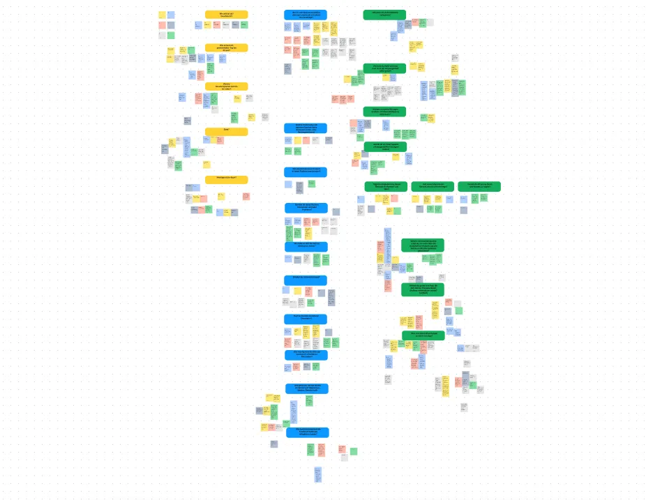
- Desk research on the target group uncovered how robotics users actually think about their work, what they need to accomplish, and where the existing tool consistently let them down.
- The research was synthesized into Jobs to be Done, creating a shared foundation for every prioritization decision that followed.
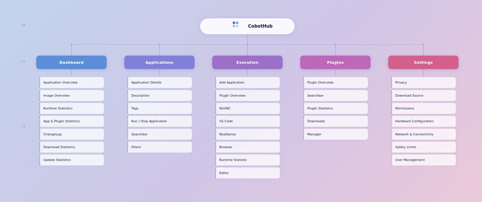
- The information architecture was restructured around core functions and user mental models, significantly reducing cognitive load across the platform.
- User flows and a fully clickable Figma prototype were created to bring the new structure to life.
- The prototype served a dual purpose: handed to developers as the basis for implementation, and presented to investors and stakeholders as a live demonstration of the product's direction.
My approach
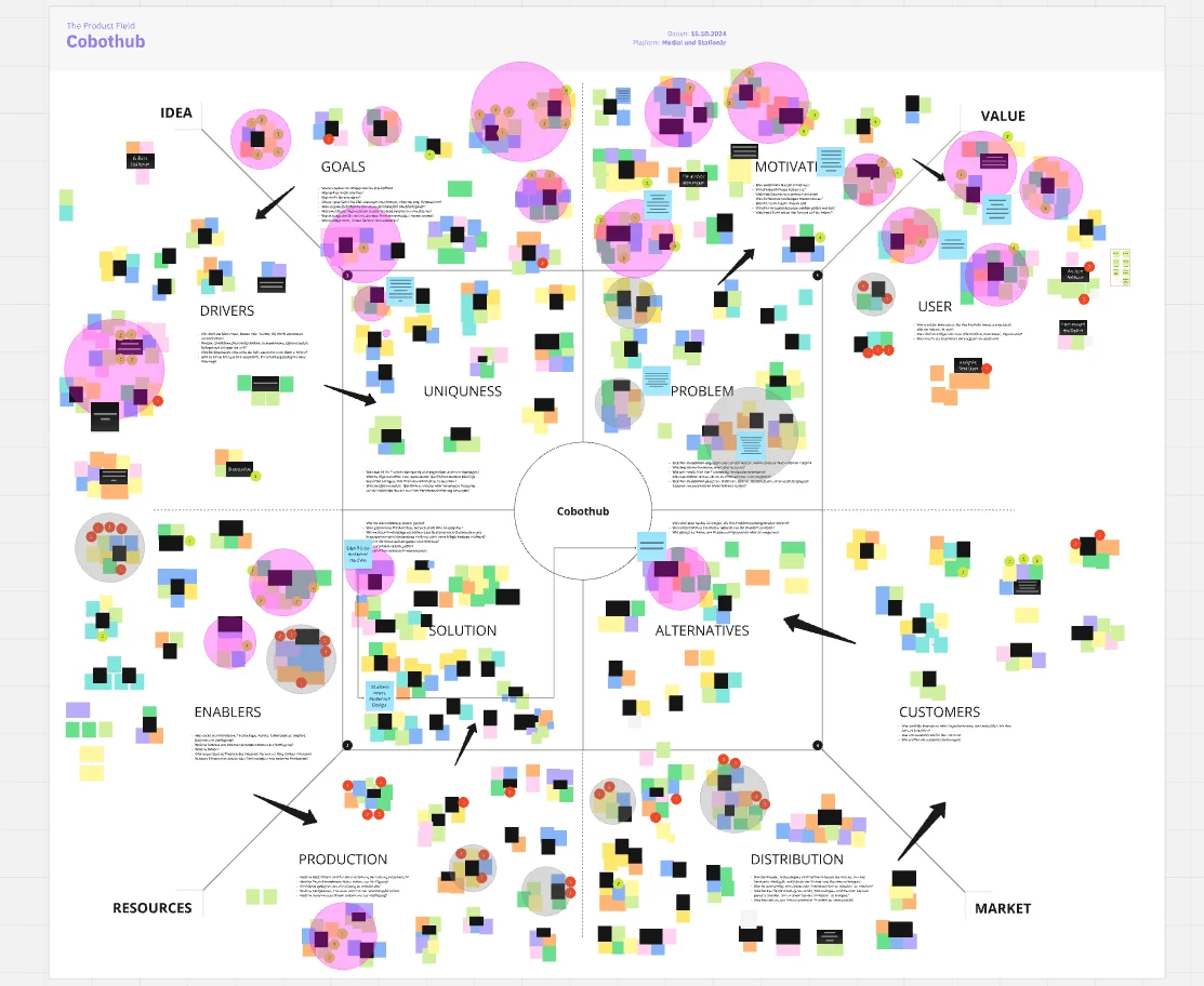
Kickoff and status quo workshop
The project began with a structured workshop bringing together stakeholders to map the current software experience. Pain points were surfaced, core workflows were documented, and the team aligned on a shared understanding of where the product was falling short. This gave the entire redesign effort a clear and grounded starting point.
Target group research and Jobs to be Done
Desk research on the target group revealed how robotics users think about their work, what outcomes matter most to them, and where existing software consistently created frustration. The insights were synthesized into Jobs to be Done that kept every subsequent design decision anchored in real user goals rather than assumptions.
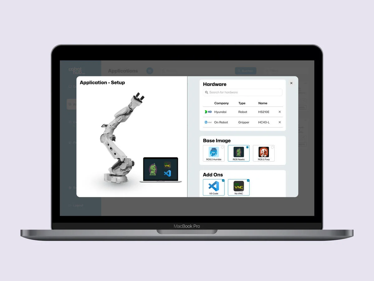
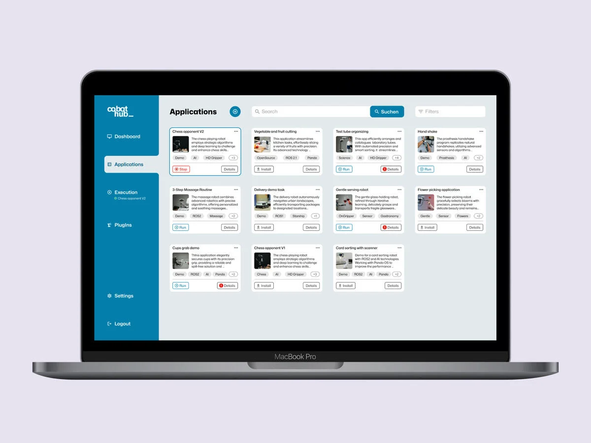
Restructuring the information architecture
With a clear picture of user needs, the information architecture was redesigned from scratch. Plugins and secondary features were deprioritized; core functions were surfaced and organized to match the mental models uncovered in research. Every structural decision was validated against the Jobs to be Done before moving on to visual design.
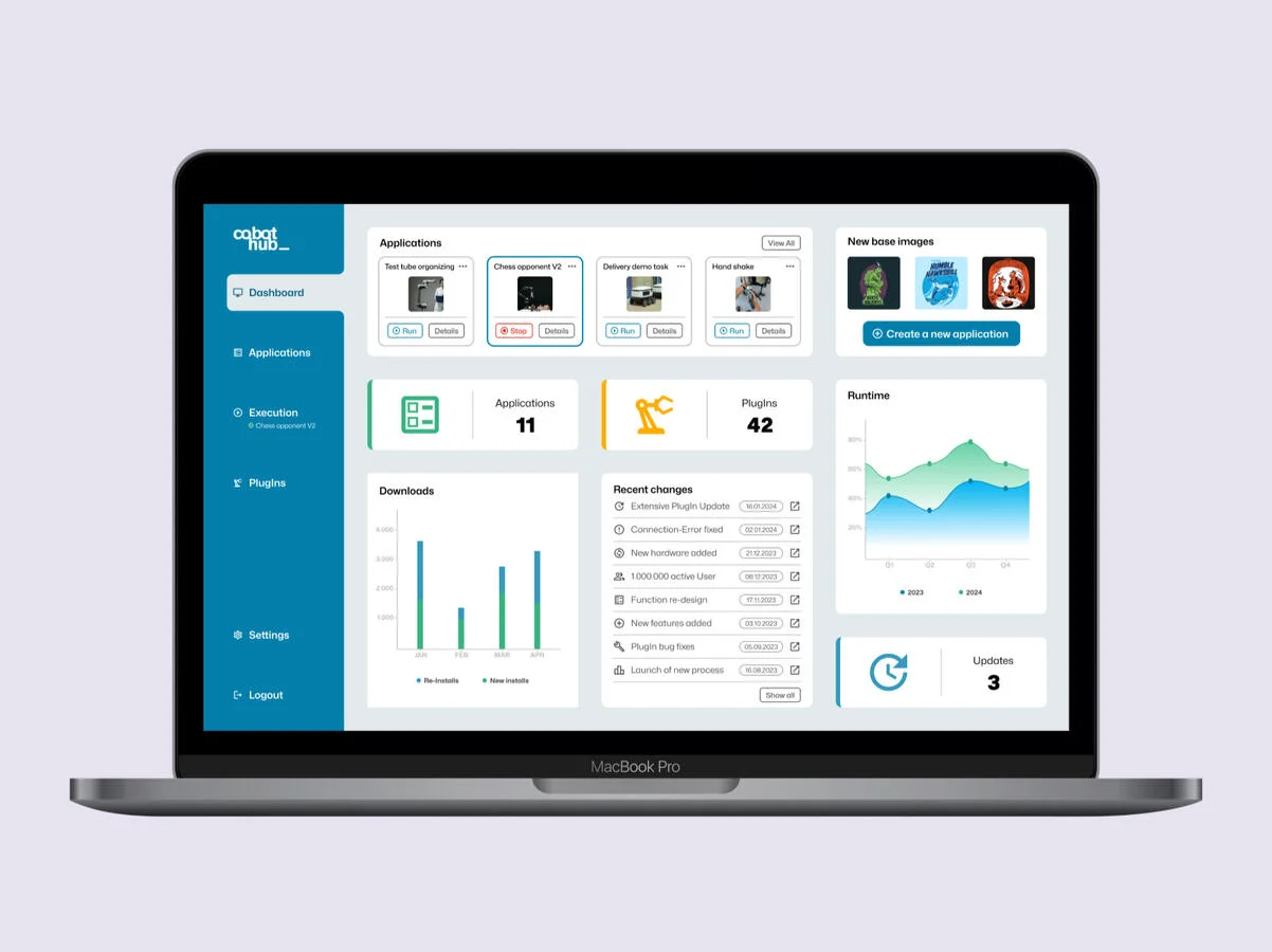
Prototyping and stakeholder presentation
The restructured architecture was brought to life as a fully clickable prototype in Figma, covering the dashboard, configurator, and key application flows. The prototype was handed to the development team as the implementation reference and presented as a live demonstration during investor and stakeholder sessions, where it received strong positive feedback.

The Impact
User errors dropped by 28% after the interface was restructured around user mental models and clearer, task-focused workflows.
Users located core functions significantly faster, with the restructured architecture, reducing orientation time across the platform.
The prototype was well received during investor presentations, contributing to continued confidence in the product's direction and maturity.
The new architecture was designed with extensibility in mind, making it straightforward to integrate future features without disrupting existing workflows.
Are you interested in collaborating?
Let's connect and explore how great design can make your product more engaging.