5 min read
Improving private banking by reducing noise to build trust
Research revealed that a significant share of private banking clients feel overwhelmed by modern financial platforms. A Jobs to be Done framework helped identify what the audience truly needs, and the result was a focused concept that is a simpler way to manage wealth online.
Project overview
Research into private banking clients aged 45 and above revealed a clear tension: while this audience values the flexibility of managing their portfolio independently, the complexity of modern broker and banking platforms creates anxiety rather than confidence. Extensive feature sets, dense information hierarchies, and unfamiliar workflows push users toward costly advisory calls or out of digital channels entirely.
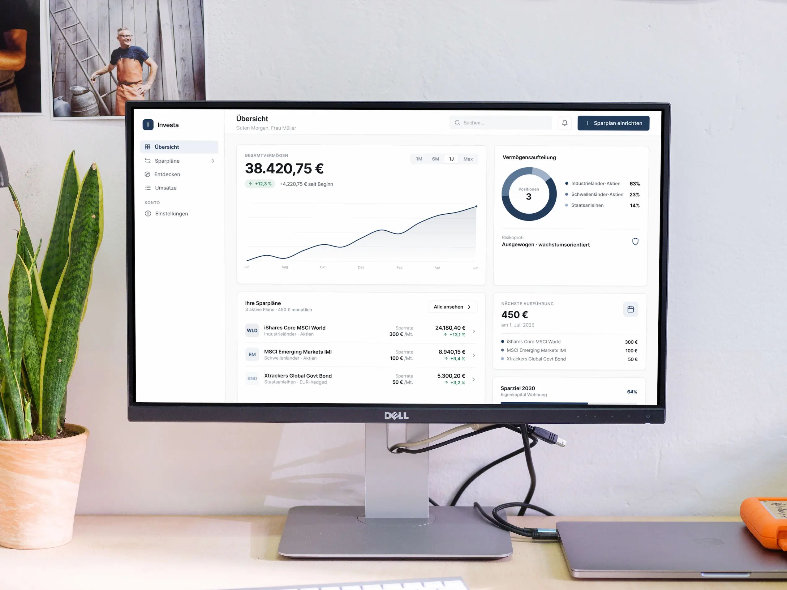
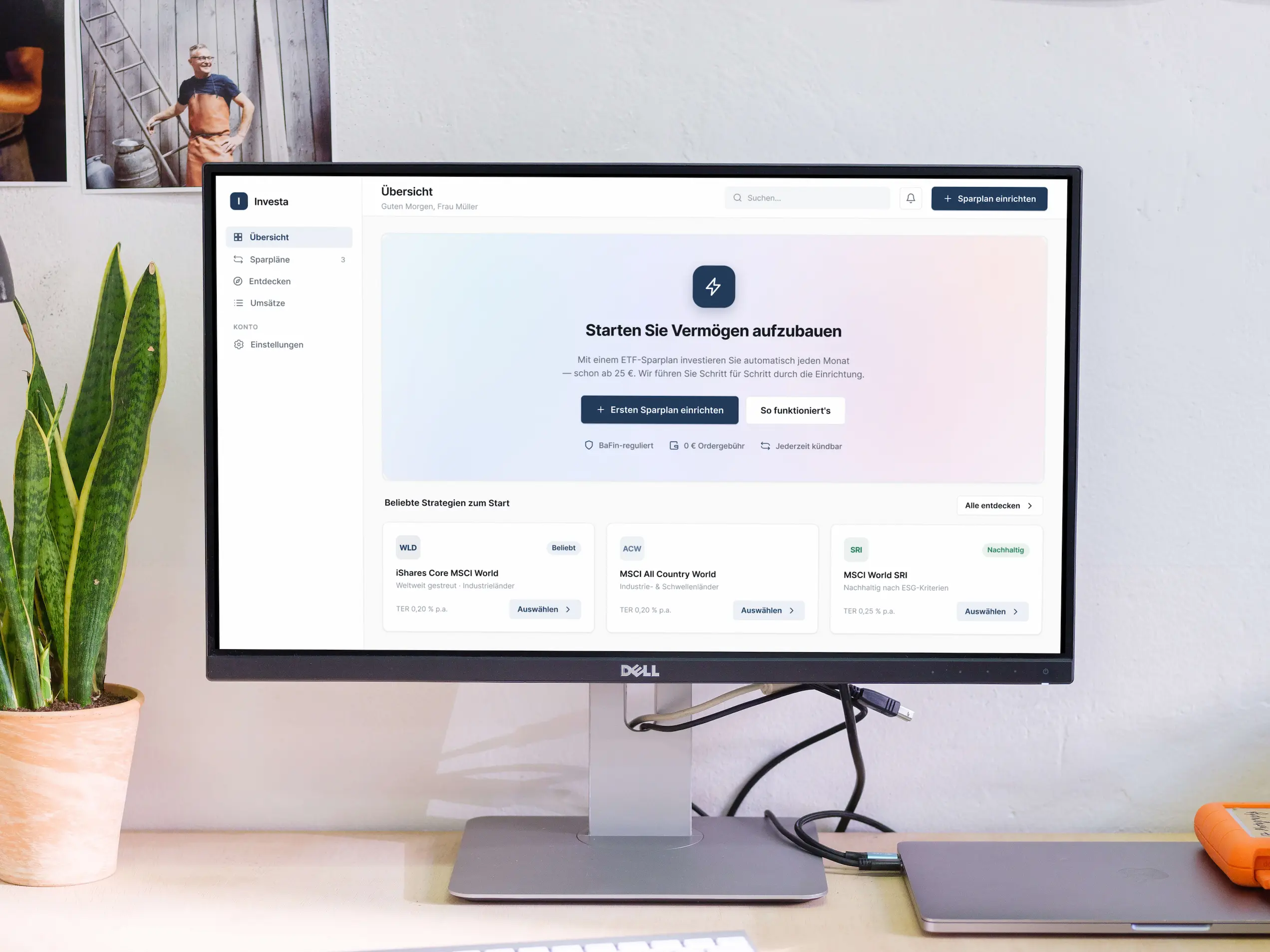
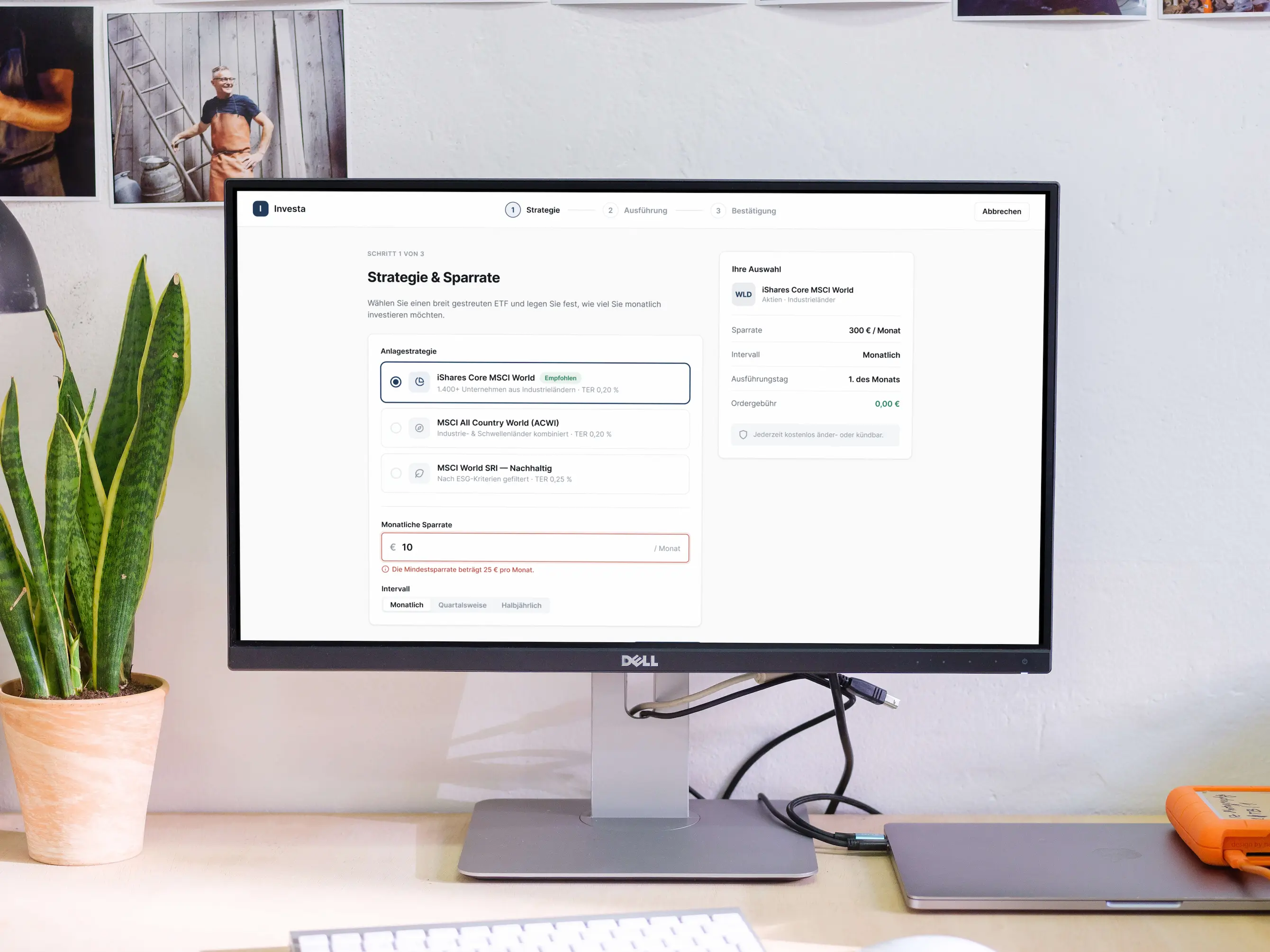
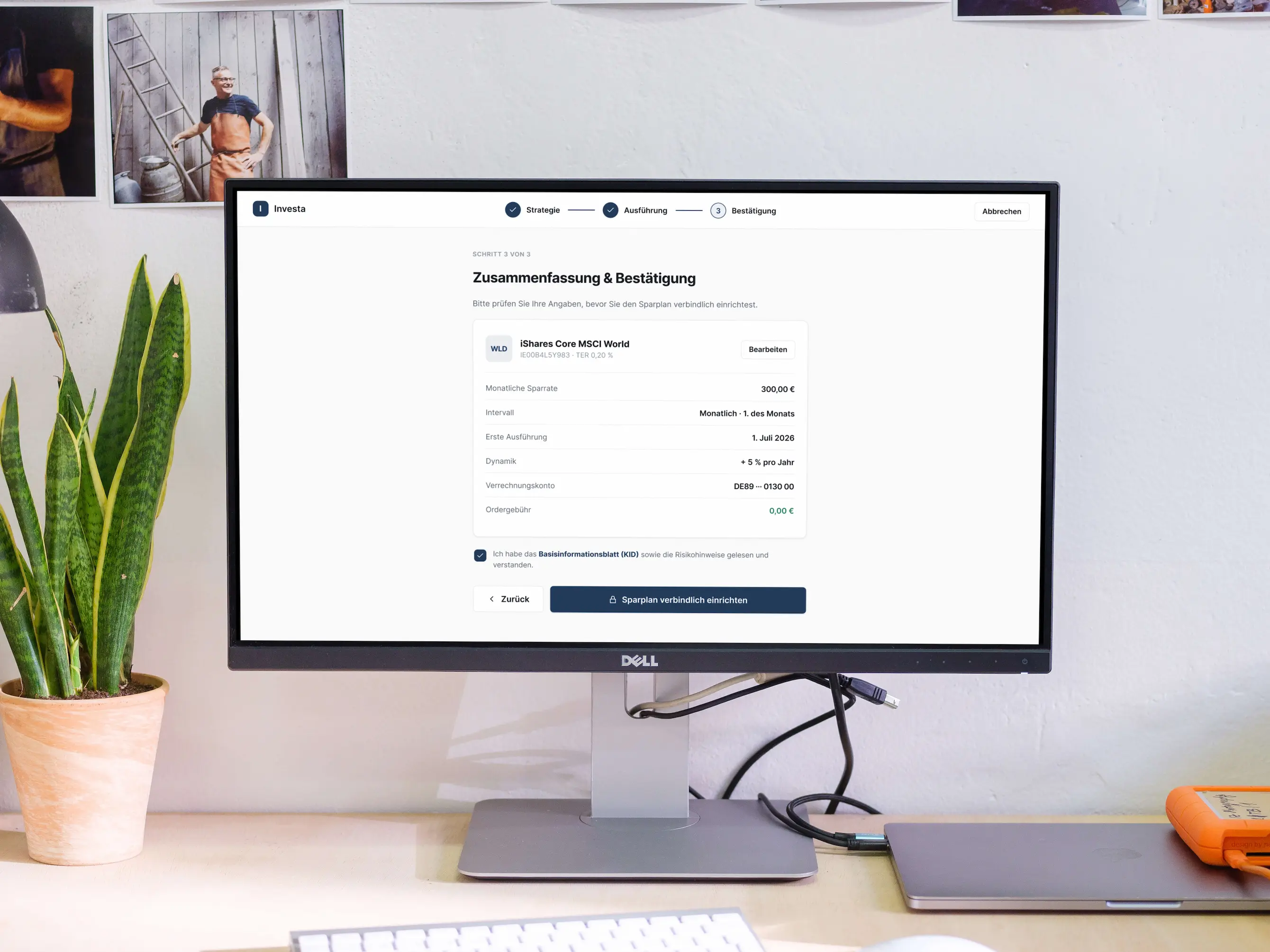
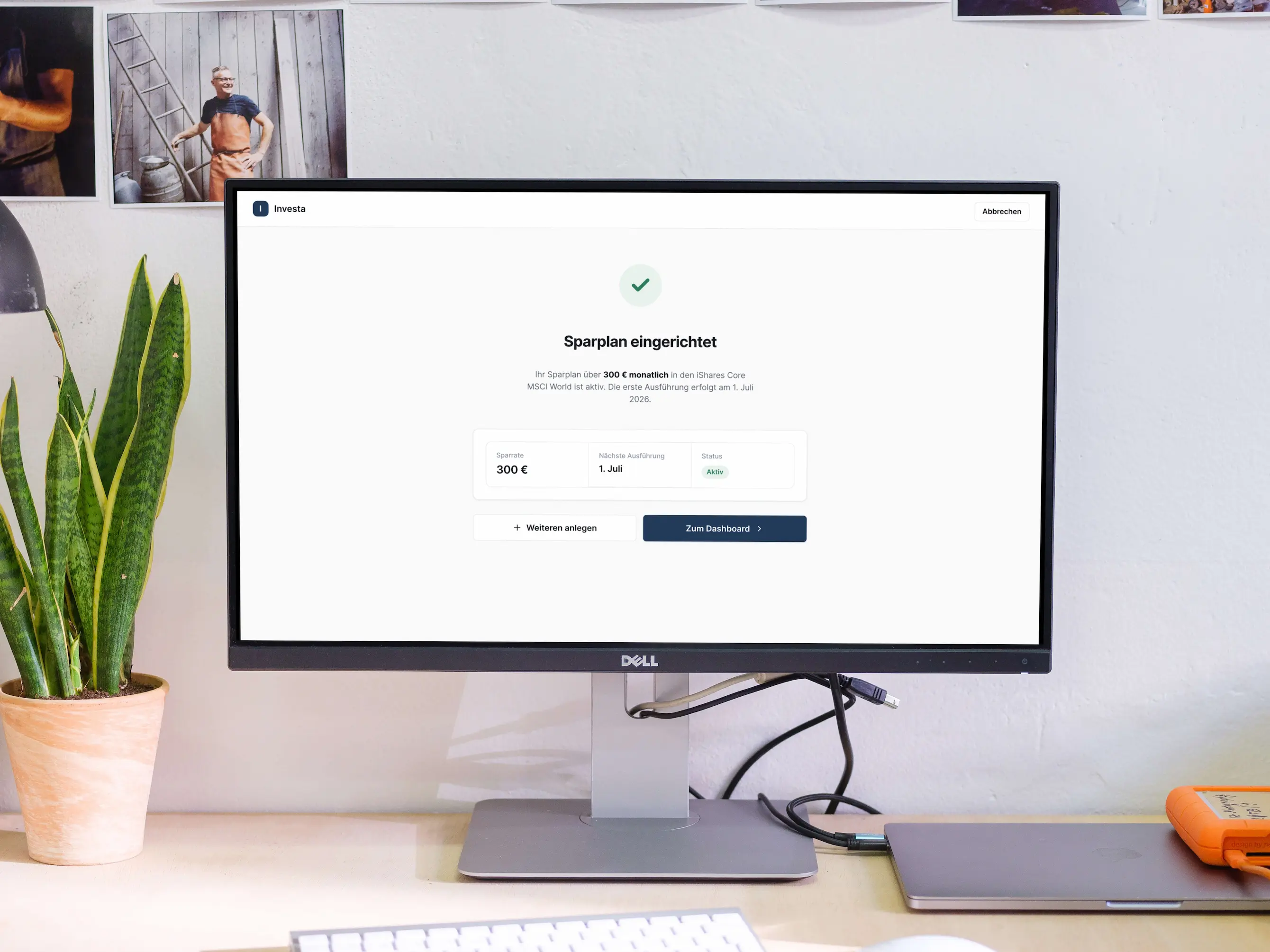
By identifying the core Jobs to be Done for this audience, a reduced investment portal concept was designed that surfaces only what users genuinely need. Every screen was built around clarity and immediate actionability. Simplifying the experience doesn't reduce its value. It increases the confidence of the people using it.
- Product Owner
- Data Analyst
- Frontend Developer
- Banker
- Backend Developer
- Investment Analyst
What I worked on
- Qualitative interviews were conducted with private banking clients to surface real needs, pain points, and expectations around digital portfolio management.
- Interview findings were synthesized into a Jobs to be Done framework, defining the core use cases of online broker.
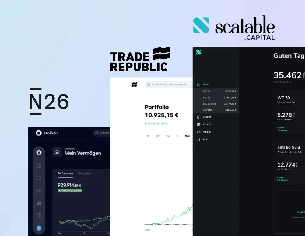
- A competitive analysis of existing banking and broker platforms mapped the complexity landscape and identified where current solutions lose this audience.
- Design principles were established to guide every decision throughout the concept phase, keeping the focus on clarity and user confidence.
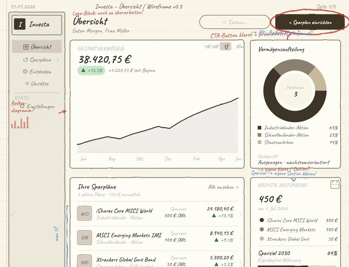
- Core user flows and wireframes were designed and iterated directly against the Jobs to be Done framework.
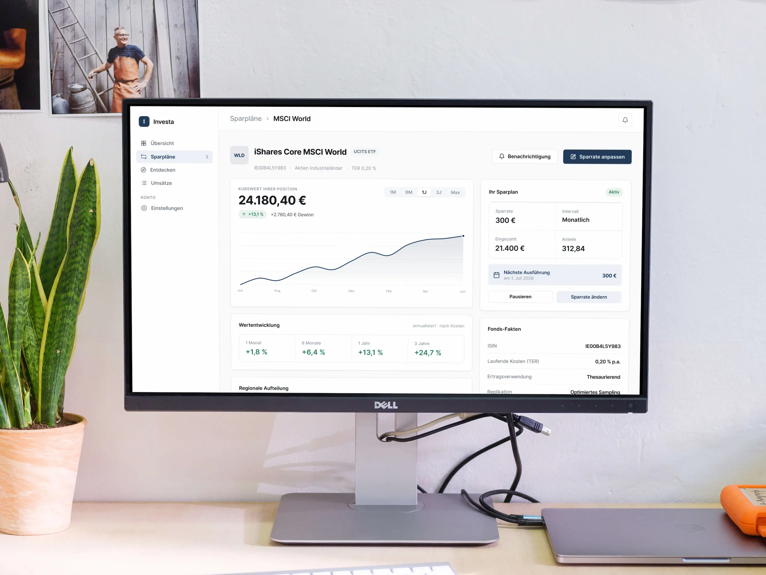
- A high-fidelity Figma prototype was created covering the most critical user journeys, built to serve as the foundation of the stakeholder pitch.
My approach
Target group research and Jobs to be Done
The project began with qualitative interviews with private banking clients to understand how this audience actually thinks about and manages their wealth. The findings revealed a consistent pattern: users do not want fewer capabilities, they want less friction around the capabilities they already rely on. These insights were translated into Jobs to be Done that gave the concept a clear and defensible scope from the start.

Competitive analysis and problem framing
Existing banking platforms and broker tools were analyzed to understand where complexity originates and why it persists. A structured comparison exposed the specific patterns that alienate the target audience: information overload, unclear hierarchies, and interactions designed for power users rather than confident everyday managers. The findings were distilled into a problem statement and a set of design principles that every subsequent decision was held against.
Concept, flows, and wireframing
The defined problem statements served as the foundation for the concept. Rather than designing around features, the information architecture was built to reflect how users actually think and navigate. The user flows were tested and refined through several rounds of wireframe iteration.
High-fidelity prototype and stakeholder pitch
The validated flows were brought to life as a high-fidelity prototype in Figma. The prototype was the centerpiece of a structured stakeholder pitch that walked decision-makers through the target audience's pain points and the proposed product direction. The concept was received positively and laid the groundwork for continued development.
The Impact
Every screen in the was reduced to its essential function, lowering cognitive load compared to the platforms analyzed during research.
The project established a UX vision, a validated set of design principles, and a Jobs to be Done framework that can serve as the foundation for the full product build.
The pitch landed was well received by decision-makers, resulting in approval to develop the concept further.
Project gallery
Are you interested in collaborating?
Let's connect and explore how great design can make your product more engaging.