5 min read
Optimized training app for scoliosis patients through gamification
A research driven redesign of Skolio's therapy app, pairing a refreshed brand identity with gamification to keep scoliosis patients engaged in their daily exercises.
Project overview
Scoliosis therapy only succeeds when patients exercise consistently, but Skolio's users quickly lost motivation and completed their routines irregularly. With no reason to return, engagement dropped off within the first weeks, putting the success of the entire therapy at risk.
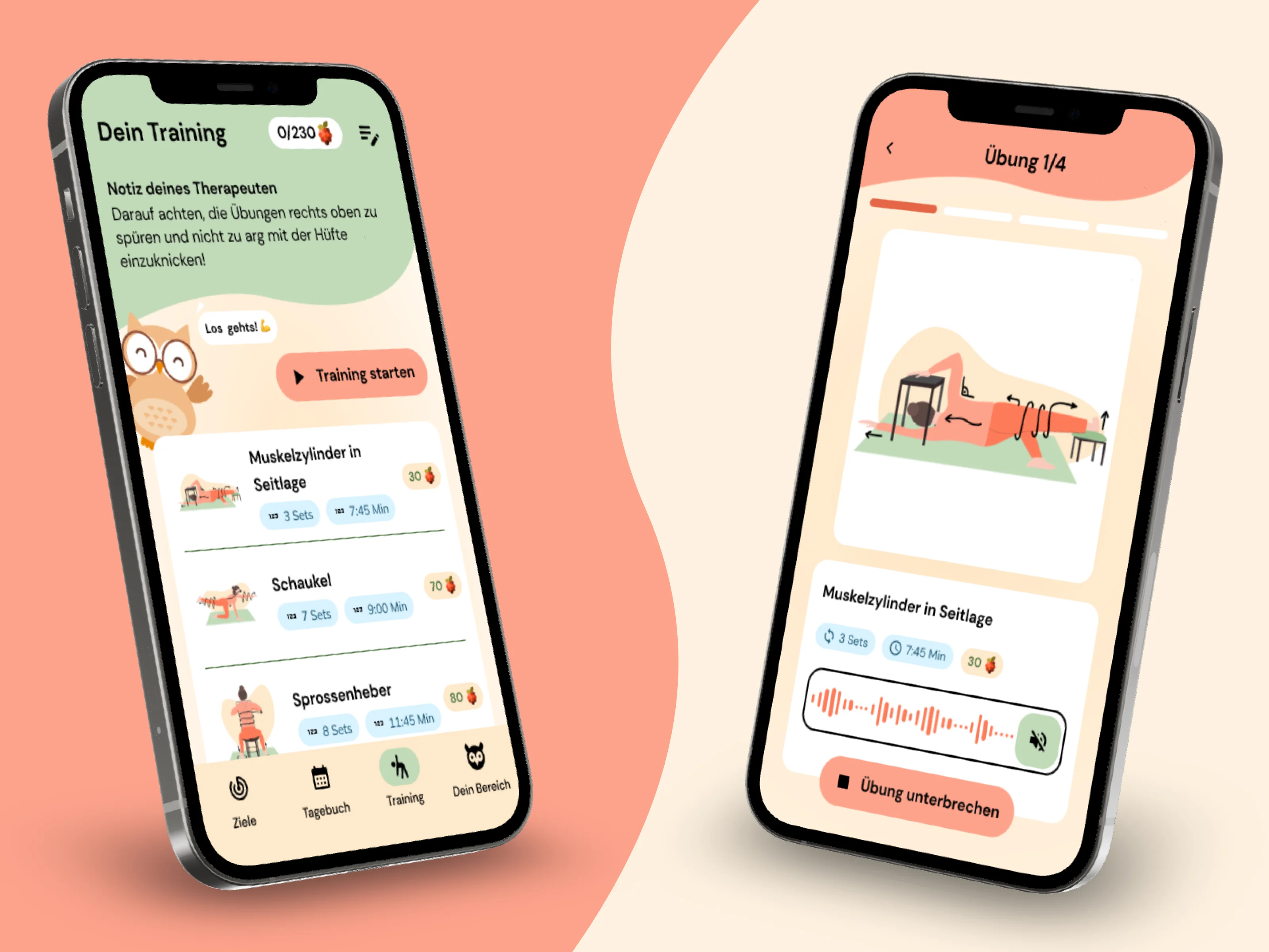
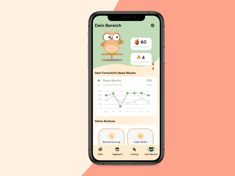
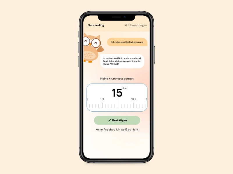
We redesigned the app around a gamification system that rewards consistency: users earn points, build streaks, and watch their therapy progress over time. Exercises were restructured to feel guided and achievable, while a refreshed brand identity made the experience feel trustworthy and motivating rather than clinical.
- Product Manager
- UX Designer
- UI Designer
- Brand Manager
- Content Designer
- Developer
- Physiotherapist
What I worked on
- I audited the existing app with a heuristic evaluation to pinpoint usability and motivation gaps.
- I planned and conducted qualitative interviews with patients.
- I built research based personas and mapped the therapy journey to locate where users dropped off.
- I translated research insights into a gamification concept (points, streaks, progress).
- I created wireframes and an interactive prototype in Figma, incorporating micro animations to bring the new user flow to life.
- I planned and moderated usability testing and prioritized findings for the team.
My approach
Analyzing the existing app
I started with a cognitive walkthrough and mapped the current state of the app: a UX audit and heuristic evaluation exposed the structural weaknesses of the previous design, from confusing navigation to unclear exercise guidance. Follow-up interviews then validated these findings and revealed additional pain points that the audit alone couldn't surface.
Defining new core concepts
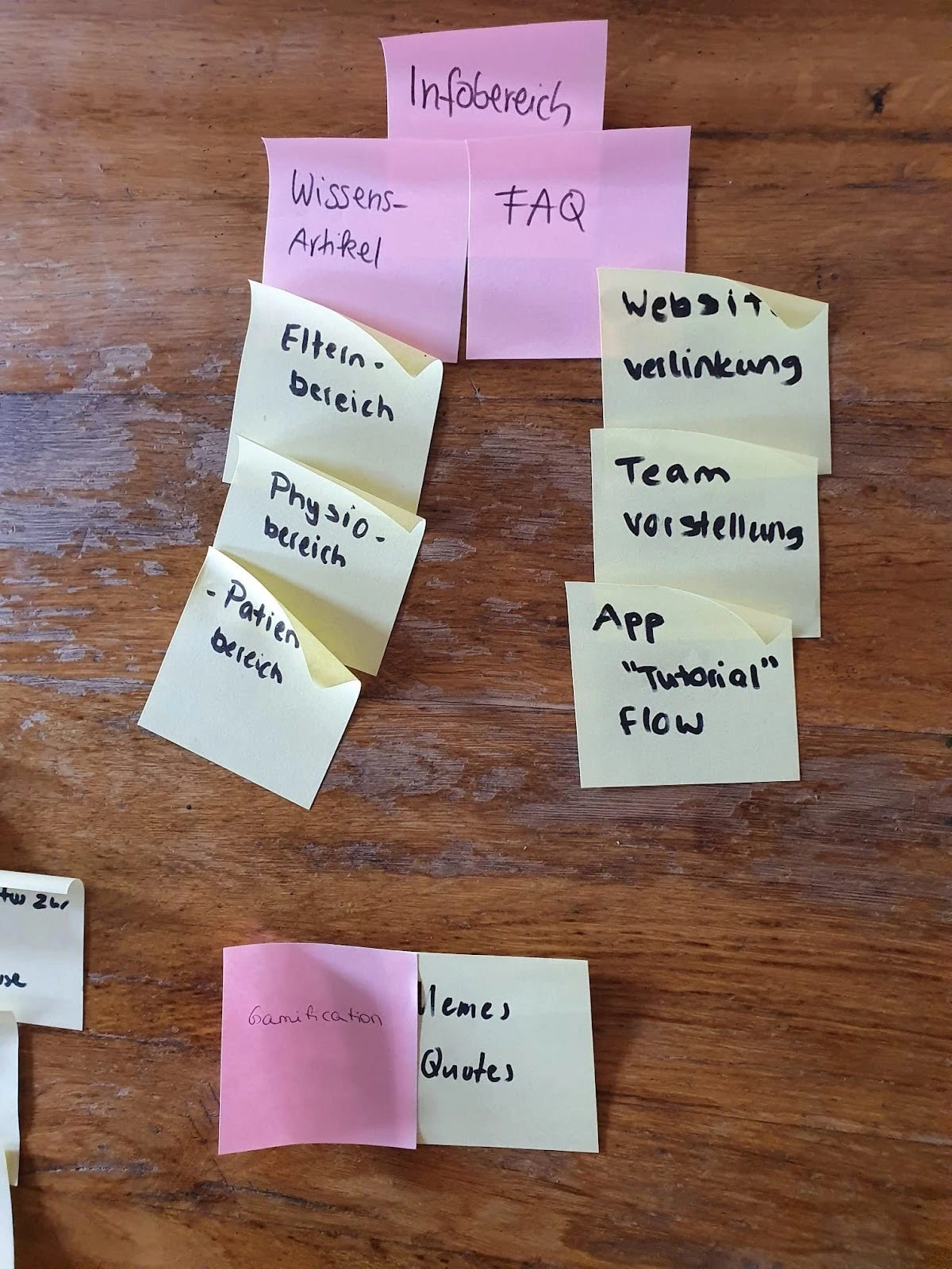
I planned and facilitated a series of interdisciplinary workshops, guiding the team through the Double Diamond framework to move from broad problem exploration toward focused, validated solutions. I led the group in translating our research findings into clear core concepts that resolved the users' pain points at their root, and implemented gamification as the central lever to turn irregular exercise into a lasting habit.
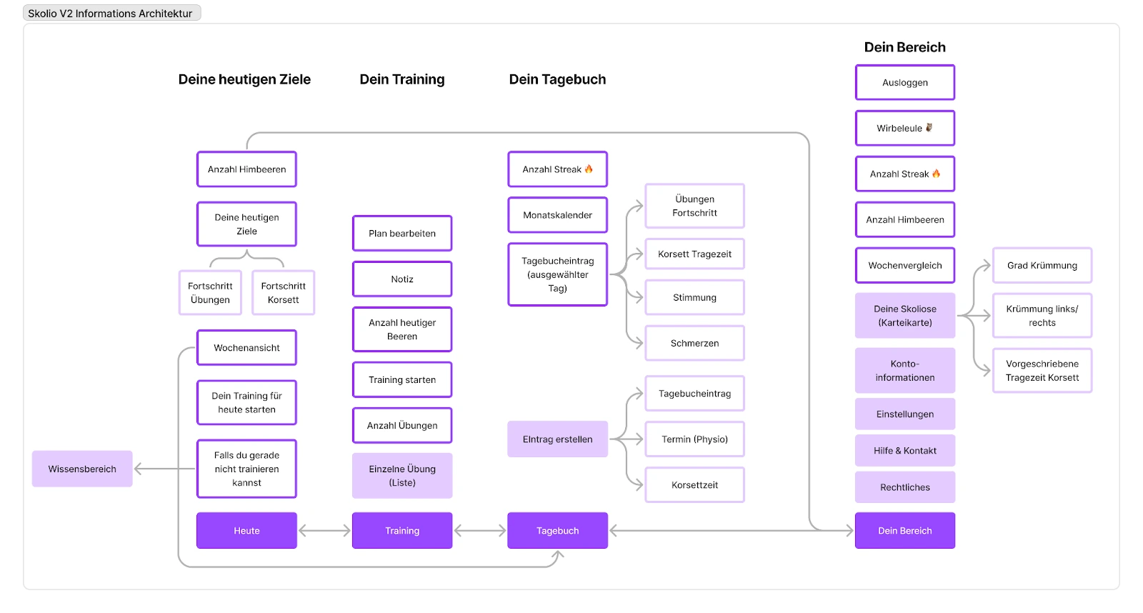
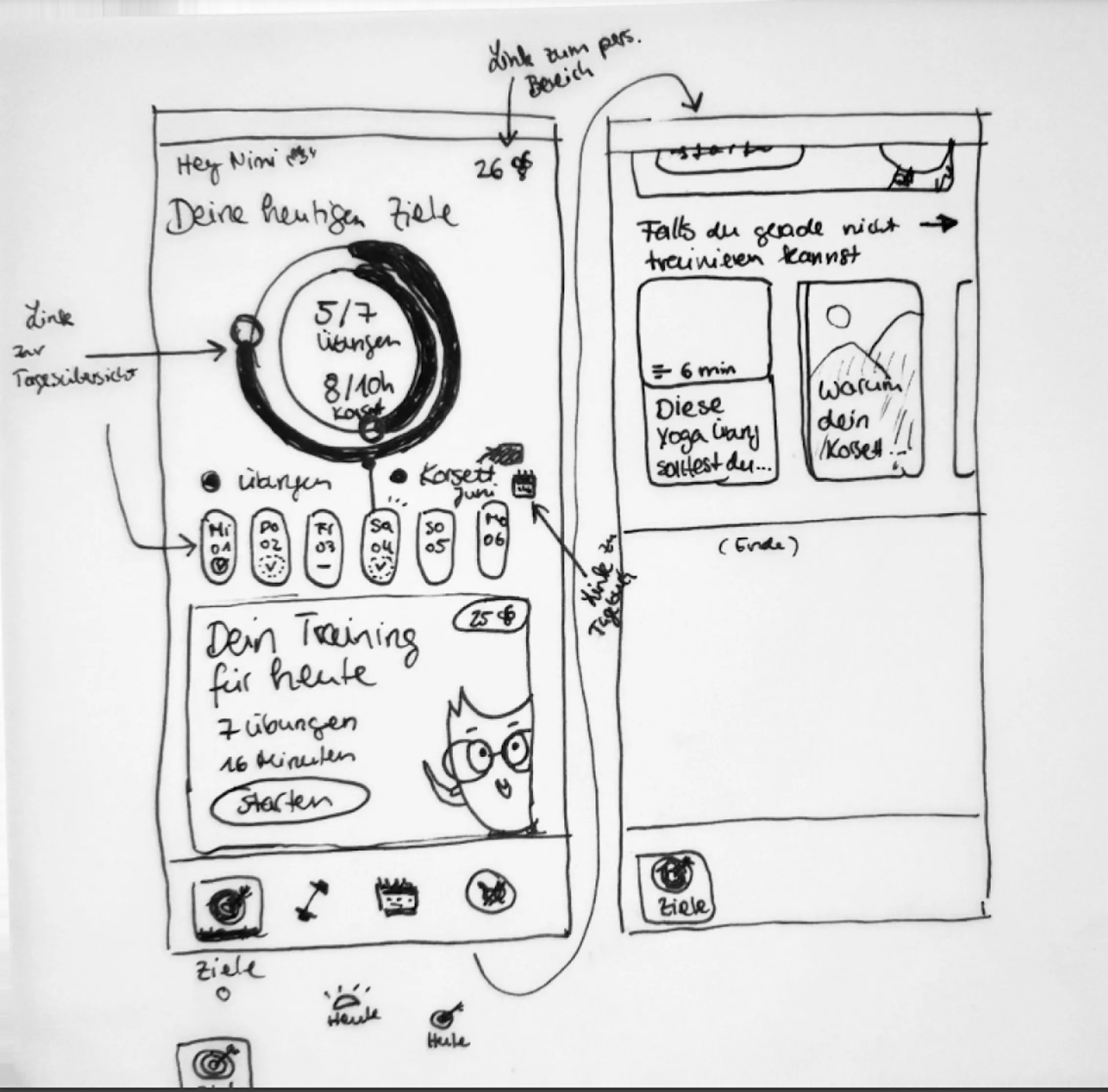
Shaping the design
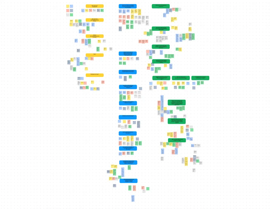
The concepts took visual form at this stage. Each screen began as a wireframe, then was refined through several rounds of feedback until the flow felt intuitive and effortless. Step by step, these wireframes grew into a fully clickable prototype in Figma, giving the team something tangible to test, challenge, and build on before a single line of code was written.
Validating the concept
Before development began, the design was put to the test with real users. An extensive usability test challenged every assumption I had made, and even though many critical moments had already been anticipated, a significant number of issues still surfaced. Each one was carefully prioritized and resolved before release, and I made sure every finding was communicated clearly to the developers so nothing got lost along the way.
The Impact
64% of tested users intended to use the app regularly after the redesign. This was a clear shift from the sporadic use seen before.
The redesign measurably lifted the conversion rate within the very first month after launch.
Visible collaboration with physiotherapists raised the app's perceived seriousness and strengthened user trust.
Research revealed parents as key motivators and decision makers, expanding the target audience and opening a new engagement channel.
A structured usability test uncovered 21 issues, all of which were resolved before development handoff.
Are you interested in collaborating?
Let's connect and explore how great design can make your product more engaging.